Introducing Quip
Today, we are extremely excited to launch Quip. Quip is a modern word processor that enables you to create beautiful documents on any device — phones, tablets and the desktop. If you haven't already, download Quip to try it out.
Why Quip?
Since the iPhone was introduced in 2007, phones and tablets have transformed the way we interact with technology and each other. Smartphone sales have already overtaken PC sales, and tablet sales are predicted to pass PCs this year. Depending on where you live, this shift may have already happened — when you walk into an airport anywhere around the Bay Area, there is barely a laptop in sight amidst a sea of iPads and phones.
To call this shift disruptive is understating its impact on our industry and the world. Companies built on the PC ecosystem are desperately trying to find an identity in this new world, and many of them won't succeed. Most people in the developing world will access the Internet for the first time through a mobile, touch-screen device without ever touching a PC.
Despite the magnitude of this shift, the software that we use to get work done has not evolved over the past thirty years. Here's one of the first graphical word processors ever created, MacWrite, released with the original Macintosh in 1984:
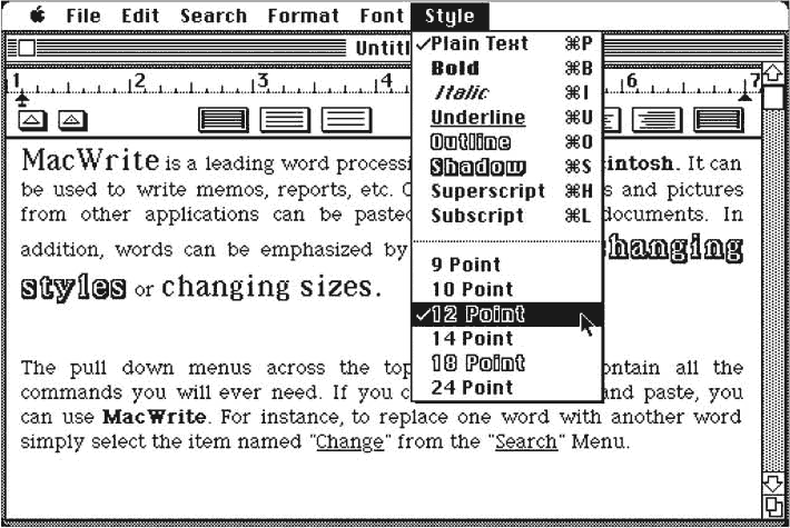
With the exception of some additional color and and a stack of toolbars at the top of the screen, it doesn't look different from the software that probably came bundled with your current laptop. We still use the same metaphors and the same workflow that we used when shoulder pads and leg warmers were cool.
The features these products have accrued over thirty years have made it difficult for most of us to switch to new products, but they have also made it almost impossible for the products to truly change. When we decided to build Quip, it was based on the premise that the shift to tablets and phones is so fundamental and so all-encompassing that it dwarfs the sum of all of these features in importance.
Quip is our perspective on how modern, mobile documents should work. We've re-thought everything — from the user interface to the underlying technology — to create the product that we want to use to get work done every day. Our entire company already runs on it. We hope you'll love it as much as we do.
What Quip does differently
We designed Quip with four core design goals:
- Collaboration - When you write a document, you almost always want to share with someone else. Quip combines documents and messages into a single chat-like “thread” of updates. You can all edit the same document — no matter what device you're on — and don't have to bounce back and forth to email to talk about it.
- Mobility - Quip works on the desktop, but it really shines on phones and tablets. Quip documents automatically format to the size of your screen — no more pinch zooming just to read a document! The product also works perfectly offline, syncing whenever you have an internet connection. Whether you're writing a document on an airplane or on the subway with a spotty internet connection, Quip just works.
- Interactivity - You can print Quip documents, but nowadays we tend to read on touch-screens rather than printing. That's why Quip documents aren't just typeset words on a page — they're truly interactive. You can turn a bulleted list into a checklist, transforming your meeting notes into a shared task list. You can @mention other documents to link between them. You can create a table of sales data, and your entire team can type data into the table at the same time.
- Simplicity - Back in the early days of GUI development, there was a popular saying: “Easy is hard.” When designing a user interface, it's much harder to remove something than to add in something new. We've worked hard to simplify the Quip interface, to leave you with a minimal, elegant design that helps you focus on writing — not ribbons.
The Desktop

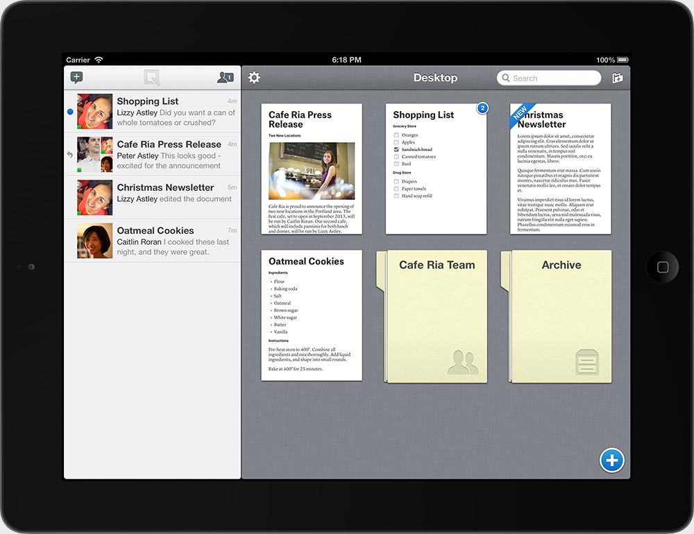
The Desktop is your home screen in Quip. On the left, you can see the Inbox. The Inbox represents everything that has been shared with you: all your new documents and messages with the most recent updates at the top. On the right, you can see the Desktop, which lets you arrange and access “your stuff”: the folders and documents that you are currently working on. In both views, the unread state (a blue dot) helps you keep track of what things you haven't seen.
A Quip Document
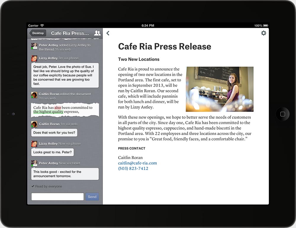
Quip combines documents and messages into a single “thread.” In the screenshot above, the conversation is on the left, and the document is on the right. The conversation includes all the activity in the document: messages, document edits, and who's viewed your changes — everything that's happened since the document was created. Staying up to date is easy: just open the thread on any device, and you can quickly see the messages and edits since you've last visited.
Document edits, or “diffs,” are one of the more unique features of Quip. Every time an edit is made to a document, a diff is added to the thread, which succinctly and visually tells you exactly what has been changed. When you're working with others or checking in from your phone, diffs make it easy to stay up to date, without re-reading the whole document.
Shared Folders
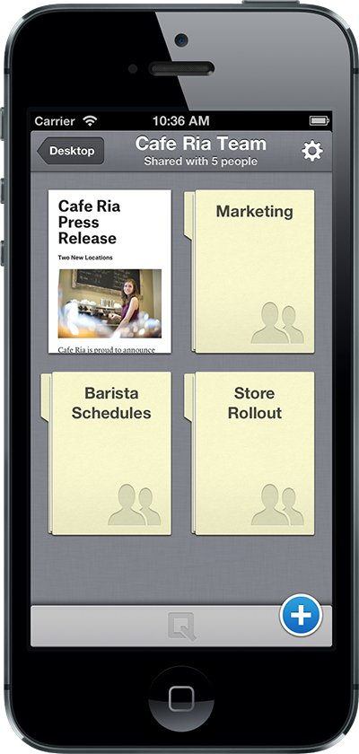
Shared folders enable you to share recipes with your family or organize a project at work. Everyone in the folder gets notified when new documents are added, and the whole group can jump in and edit or discuss changes in real-time.
Even the arrangement of the documents on the screen is shared — one organized person on your team can keep stuff in order for everyone.
Instant communication
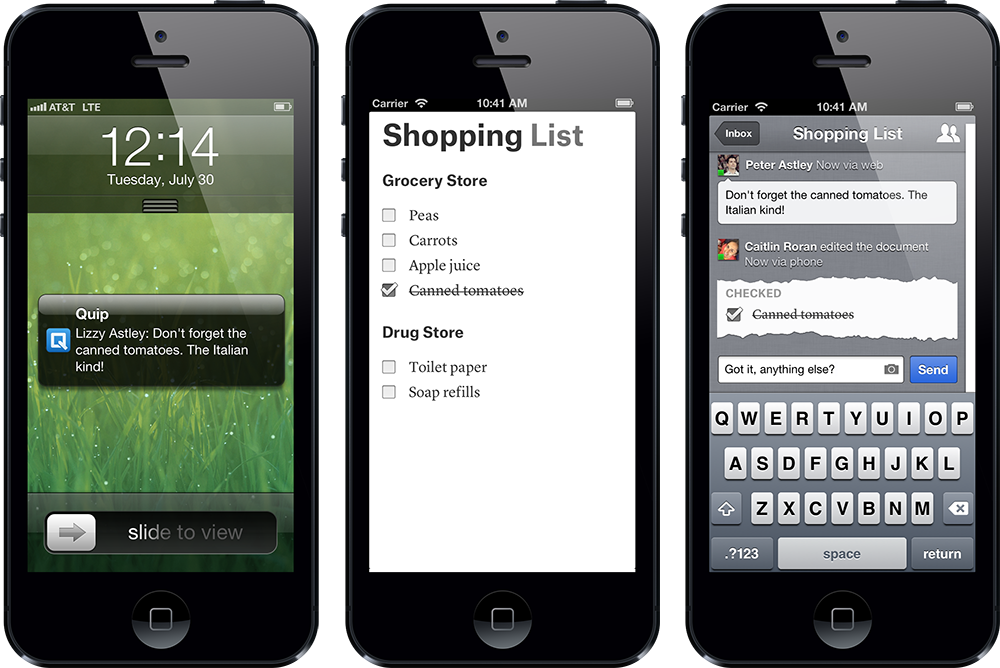
With Quip, your phone, tablet, and desktop all work together so that communication and collaboration happens instantly in a light-weight way. You get a push notification whenever there's activity in one of your documents. That means you'll get a notification if someone adds something new to the grocery list when you're at the grocery store, and you can respond while you're shopping. Likewise, when you send your boss a proposal, you'll get a notification when she opens it for the first time, and you can jump in to interactively walk her through it.
Using Quip
Quip is available today. To create an account on your iPad, iPhone, or iPod touch, install the app. To create an account on your desktop, visit https://quip.com/.
We also have an Android app in the works. If you already have a Quip account and are willing to tolerate a few quirks, you can download the Quip Android Preview Release today in the Google Play Store.
Quip is free for personal use and a subscription-based service for businesses. If you want to try Quip at your business, just install the app — it's free to try, and that's the best way to decide whether the product works well for your team. For more details on pricing, check out the Quip Business page.
Our mission
When we started this company, our goal was to create products for work that you actually enjoy using every day. We think it's a shame that the apps we use at work are old, poorly designed, and bear the legacy of thirty years of feature creep and clutter. We think your time at work should be composed of the same delightful, beautiful experiences you've come to expect from modern mobile apps. We are starting with the word processor, but our mission is to eventually build the productivity suite for the mobile era.
We hope you enjoy using Quip as much as we enjoyed creating it.
—Bret & Kevin

