Quip 1.7 - Like Button, Comments, and Themes
We have a long history with the Like button at Quip. Several Quip employees come from FriendFeed, where we launched the Like button in 2007 as a lightweight way to acknowledge people's posts. When Facebook rolled out their Like button in 2009, the feature became a cultural phenomenon. The FriendFeed team joined Facebook in 2009, and a number of us joined the team that rolled out the Like button to the rest of the Web. Today, it is difficult to find a web page that doesn't have a Like button.
The power of the Like button is its simplicity: with a single click, you can tell a friend that you appreciate what they've done. It's a small gesture, but it has also become a meaningful way to communicate and bring people closer together.
Today, we're introducing the Like button on Quip in an effort to bring some of these positive social interactions into the workplace. More than any other feature, the Like button illustrates our deeply held belief that the software we use to get work done should be as fun to use as the software we use outside of the office.
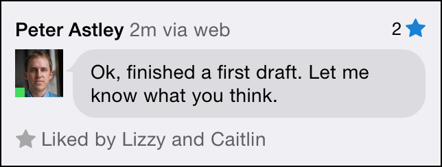
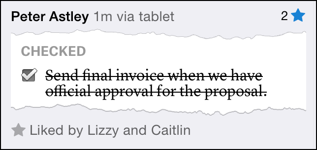
On Quip, you can “like” people's edits in addition to their messages. That's been the most enjoyable part of the like feature in our experience. Every time you check off something in a shared checklist, the likes stream in, and you feel a great sense of accomplishment and camaraderie:
The Like button is just one of five large new features in our new release, Quip 1.7. Without question, Quip 1.7 is the most significant release we've had since we launched seven months ago. It's the result of months of effort from the entire Quip team, and we're releasing it simultaneously on the iPhone, iPad, Android, and the desktop version of Quip.
Comments & Highlighting
With Quip 1.7, you can now highlight a specific part of a document and have a conversation about it.
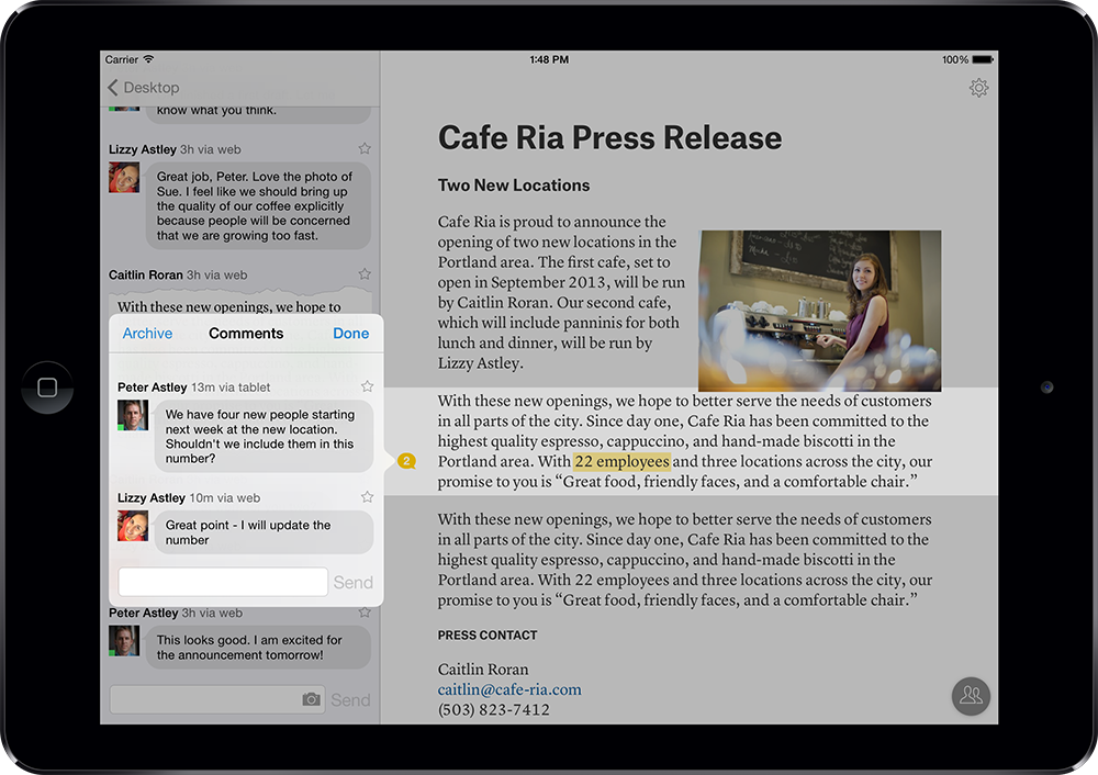
When someone leaves a comment in the document, you'll see a message bubble in the margin letting you know, and you can read the comment thread on your desktop, tablet, or phone. Once you've installed Quip on your phone, you'll get notified every time someone leaves a comment, and you can respond without leaving the document:
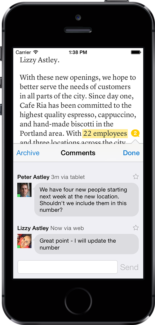
The ability to leave inline comments has been the most frequently requested feature from our customers, and we're proud of how well the experience works across all of the devices Quip supports.
Themes
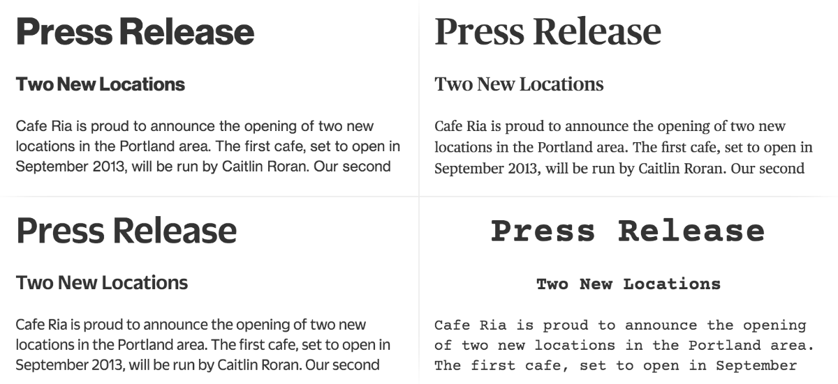
We want your Quip documents to look beautiful on every device. That's why we put a great deal of thought into the typography of Quip documents when we first released the product. And today, we're excited to roll out four new, professionally designed themes for Quip.
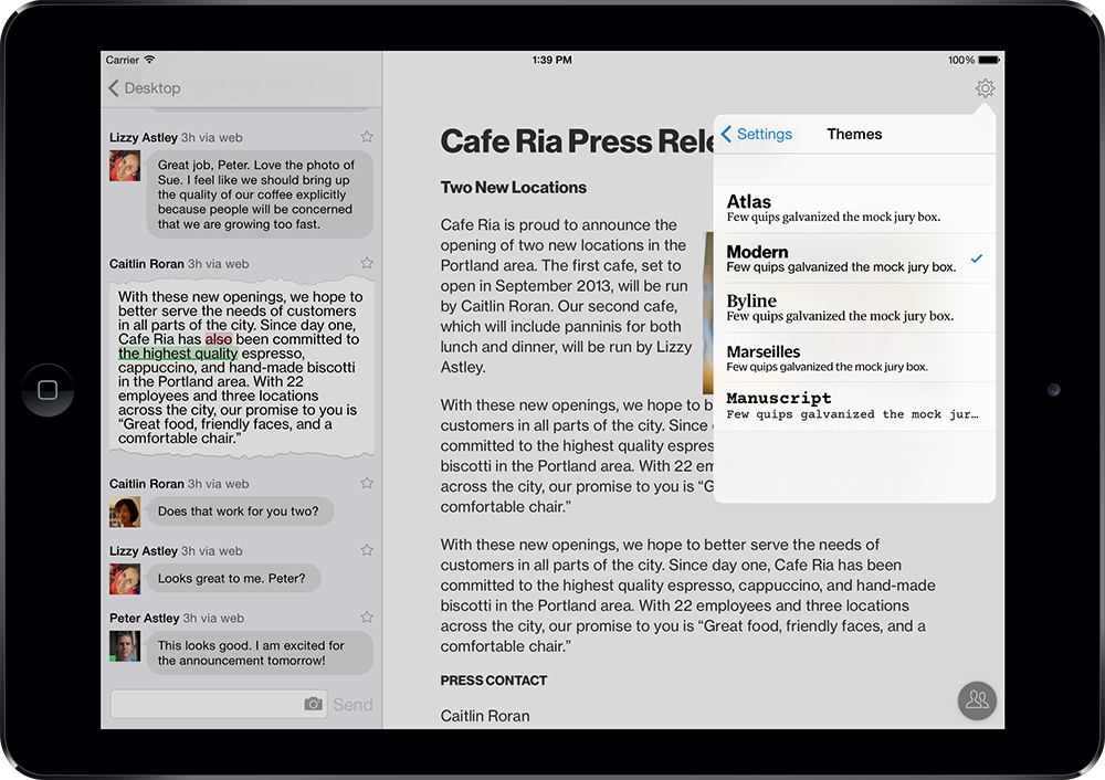
For Themes, we chose typefaces from Commercial Type with a broad range of personalities.
Your Quip documents will still look professional and beautiful on every device, but they no longer need to look the same. We're looking forward to expanding our selection of themes in the future, and we're thrilled that more people will be able to use these gorgeous typefaces with this release.
Document Versioning
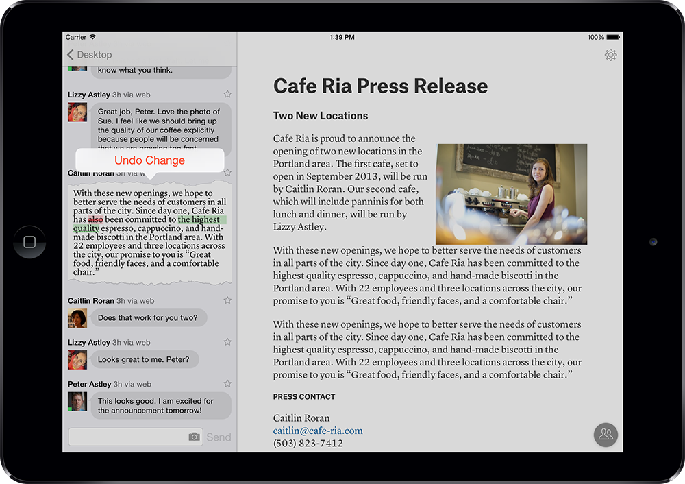
With Quip 1.7, you can click on any “diff” to restore the document to a previous version. You can revert to any previous version of the document, no matter how long ago the document changed.
Android Widget
In this release, we've also introduced two widgets for Quip on Android, which allow you to either view your inbox or a document from your phone's home screen / launcher.
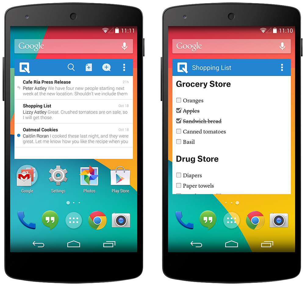
With the widget you can keep your personal to-do list always in view, making it easy to stay on top of tasks and check things off as you go.
In addition to these big features, there are also a number of smaller improvements in this release, like faster real-time updates. We hope you enjoy the new stuff and, as always, keep the feedback coming!
